I've been testing the Alpha version of Ubuntu 11.10 Oneiric Ocelot for a few weeks now. The updates have been pretty meaty (150+MB a pop), but the improvements have been regular and substantial.
Last night before going to bed I updated Ubuntu 11.10 on my laptop and then went to sleep. This morning when I booted up I noticed quite a few UI improvements and overhauls.
 |
| My Ubuntu 11.10 Desktop. Notice the new darker "Dash Home" icon/button in the top-left corner of the Unity Dock and the new "On/Off" settings icon in the top-right corner of the screenshot. |
The biggest UI overhaul seems to have taken place in the Ubuntu Software Centre (the app store - Mac OSX and iOS - "inspiration"...). The new UI is shiny and just as intuitive and easy to use as it used to be. Below are some screenshots of the new Ubuntu Software Centre experience:
 |
| The Ubuntu Software Centre homescreen. |
 |
| The Ubuntu Software Centre while installing an application. |
 |
| The Ubuntu Software Centre while looking at application details. |
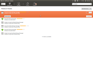
 |
| The Ubuntu Software Centre while browsing applications. |
As you can see the Ubuntu Software Centre has had quite a UI overhaul. I have enjoyed using it so far and haven't encountered any problems with it.
As for the rest of the Ubuntu 11.10 Oneiric Ocelot there have been quite a few improvements in terms of speed (especially at boot up/ shut down) and stability on my machine. You can find out more about Ubuntu at
www.ubuntu.com
As usual, feel free to leave comments and/or questions below. If you liked this article, please Google +1 it.